
When you invest in PPC, every click has a cost. Once someone lands on your page, the job of that page is simple: convince the visitor to take action. Strong ads can get people through the door, but it’s the landing page that determines whether those clicks turn into leads or sales.
This guide walks you through a practical framework for building and improving landing pages that convert. It’s based on years of hands-on experience working with clients at Search Engine People and across many industries. The goal is to give you a guide to the elements you should focus on first to optimize your landing page.
That said, remember that nothing beats knowing your audience well. If you have learned from previous A/B tests run on your pages or received direct customer feedback indicating that these practices don’t work for your audience, listen to them. Your users have the final word.
For those who are not sure where to start or are looking to try a different approach, let’s get started:
1. Start With a Clear Conversion Goal
Before you design or rewrite anything, define what a successful conversion looks like for your campaign. It might be:
- A form submission
- A booked call (can be done on a phone call or a scheduling app like Calendly)
- A demo request (typically a form submission)
- A completed purchase (eCommerce store)
Once the goal is defined, make sure your tracking (Google Ads, Analytics, CRM integrations, phone tracking, etc.) is set up correctly or will be set up before your campaign runs. When you know which actions matter most, optimizing the page becomes much easier. For example, if phone calls matter a lot to your business, prominently feature the phone number in the page header.
Quick reminders:
- Keep one primary conversion goal per landing page.
- Avoid “mixed” objectives. If the page tries to do too many things, it usually does none of them well.
2. Match the Page to the Ad Intent
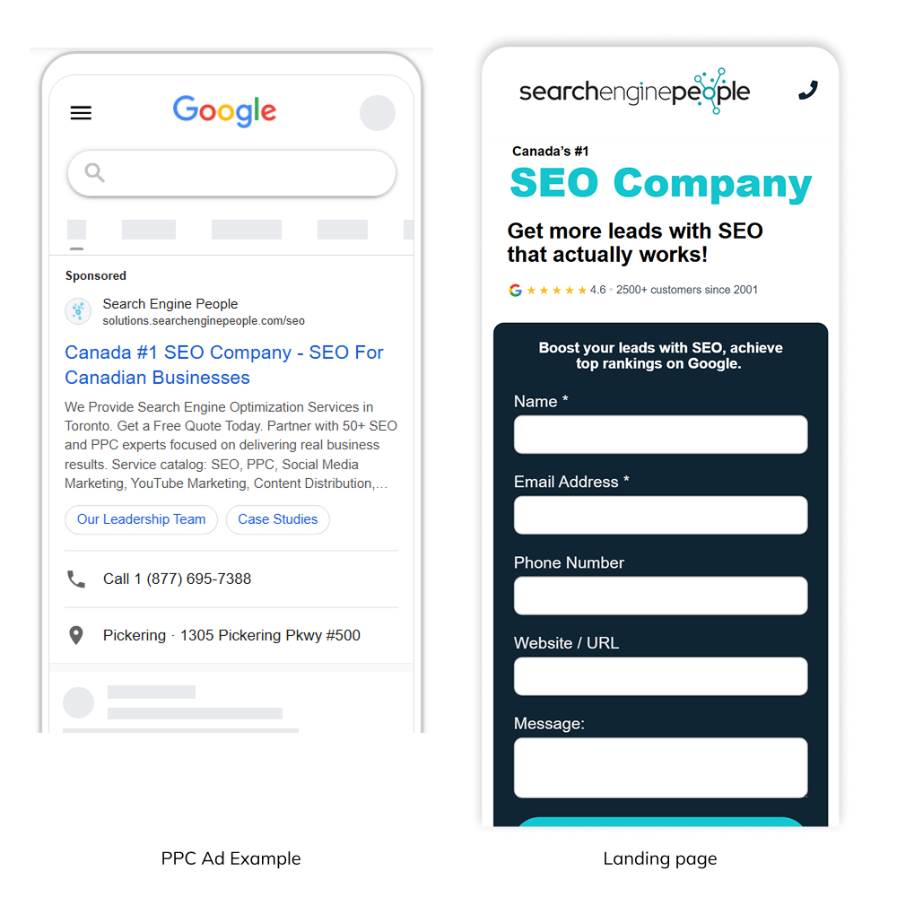
The quickest way to lose a visitor is to make them feel like they landed on the wrong page. This is why message match is so important. The promise made in the ad should connect directly to the headline on the landing page.
I remember seeing an ad on social media of a supplements company promoting a seasonal discount of 20% on one of their top-selling products. The offer was promising. I decided to give it a shot and click on the ad.
The ad took me to the homepage of the company. On this page, I found general information about this company, but there was no mention of the product I was looking for or the promotion that got me excited. Confused, I decided to leave and go on with my busy life.
You would be surprised, but many online experiences work this way. Sometimes, not so disjointed like the example above, but many are not consistent.
Every time you promise something in an ad, that includes your benefits and USP, you need to mention this on your landing page front and center. Users navigate fast, scan content in seconds, and make a decision in the blink of an eye.
A few practical tips:
- Build a dedicated landing page for each core offer, product or service, or ad group.
- Use the same keywords, benefits, or value props from the ad in the main headline and sub headline.
- Keep the page focused on the action you want. Remove navigation or anything that pulls attention away from the goal.
The moment someone arrives, they should feel, “Yes, this is exactly what I clicked on.”
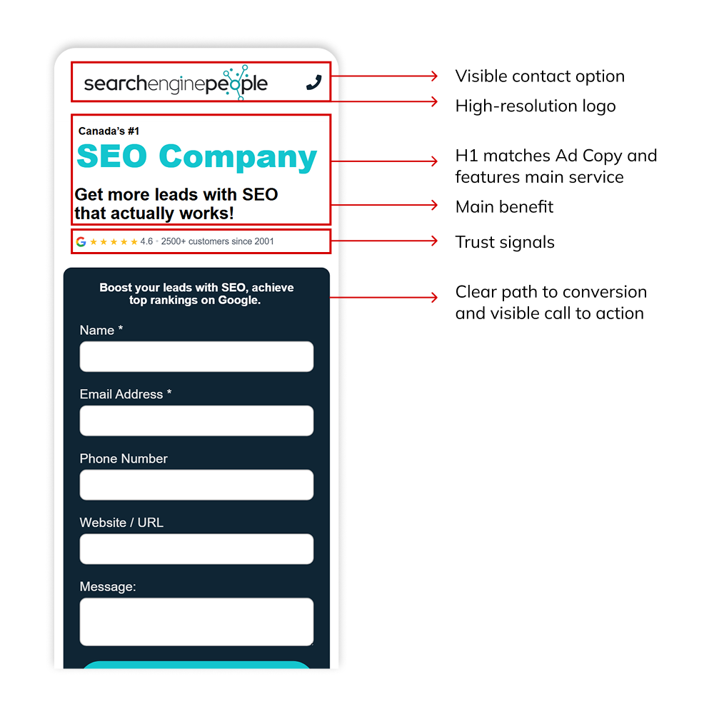
3. Optimize the Above-the-Fold Section
The first screen a visitor sees determines whether they stay or leave, so the above-the-fold section needs to communicate the essentials right away.
Keep this area focused and purposeful. Your headline should match the intent of the ad, your main value proposition should be easy to understand, and your primary call-to-action should be visible without scrolling.
Avoid clutter or competing elements here. A clean, concise above-the-fold layout helps visitors quickly confirm that they’re in the right place and encourages them to take the next step.
Good design principles:
- Use clear headings, short paragraphs, and bullet points.
- Highlight your USP or main benefits
- Place the primary call-to-action button (or form) where people can see it right away
- Include trust signals (Reviews, certifications, industry accolades, or a short testimonial)
- A strong hero image, especially if you are selling a product or SaaS
The design doesn’t need to be fancy. It just needs to help visitors understand the offer and take action quickly. Remember ‘KISS’, keep it simple, stupid. A design principle that continues to be effective today.
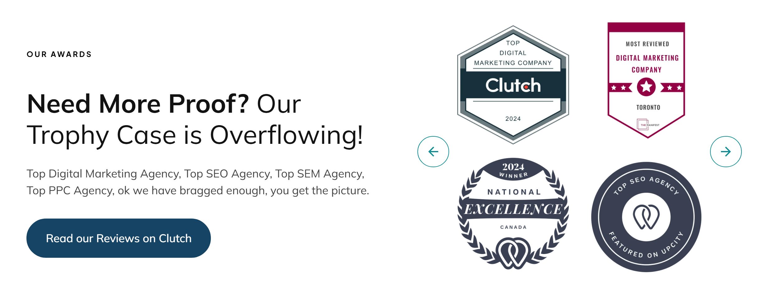
4. Build Trust With Social Proof and Transparency
Visitors won’t convert if they are unsure about your credibility. Trust has a big impact on conversion rates, especially for lead-generation and higher-commitment offers.
We already mentioned you need to include some trust signal elements in the above-the-fold section, but also asked that you keep the design simple and clutter-free. This can be particularly challenging on mobile devices, where the space is more limited.
The good news is that you can add other sections to your landing page where you build trust and increase social proof. The way you do this can vary depending on your industry and product or service.
For instance, many medical and therapy providers have strict regulations in their industry about featuring Google Reviews or testimonials on a landing page. In this case, including certifications and logos of the regulating organizations can transmit trust while staying compliant.
In some other situations, like SaaS, featuring reviews from industry-recognized platforms like G2, Capterra and Software Advice can be highly effective.
Make sure the trust signals you feature are meaningful to your target audience and keep them transparent ALWAYS. The last thing a user wants to see is an inflated rating and testimonials with zero substance or helpful comments. Keep it real. Users can easily spot non-transparent practices and will reward legitimate reviews.
Helpful trust indicators include:
- Testimonials or reviews
- Case-study snippets or performance metrics
- Client or partner logos
- Industry certifications or awards
- Clear privacy and security statements
Food for thought: These elements can be very effective when placed near your form or CTA, where people might hesitate.
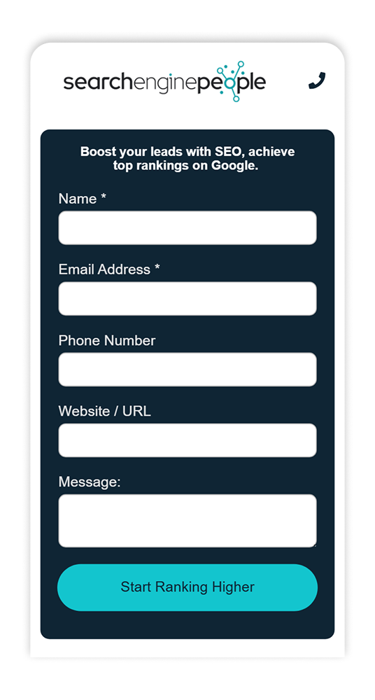
5. Simplify Your Forms and the Path to Conversion
Long, complicated forms are one of the biggest conversion killers. It’s common to see businesses include ten or more fields, hoping to qualify leads upfront, but this can have on opposite effect. The more overwhelming the form feels, the fewer people will complete it.
Of course, if the main objective of your business is to improve the quality of your leads, keeping those qualifying fields makes total sense. However, in many cases, the requested information is not fundamental and can be requested later in the sales process.
A good rule of thumb is simple: ask only for the information you need to start the conversation. If all you truly need is a name, email, phone number, and some comments, stop there. You can gather additional details later through a follow-up call or email.
For situations where more information is genuinely required (such as generating an accurate quote or setting up a custom product demo), consider using a multistep form. Breaking the process into smaller, more digestible steps reduces friction and keeps users moving forward. Each step should feel manageable. If the overall experience becomes less intimidating, it will lead to less hesitation and higher completion rates.
Some other general recommendations about forms:
- Use inline validation (so users catch errors as they go and don’t miss a required field)
- Include reassuring micro copy near the submission CTA (for example, “no obligation” or “We never share your information.”
- Use a strong CTA that communicates the end benefit of submitting the form. A generic “submit” is not persuasive enough
- Set up a thank you page where you communicate to users when they will hear back from you, or what’s the next step in the process
6. Make Sure the Page Performs Well Technically
Even a great offer won’t convert if the page loads slowly or breaks on the browser your audience uses the most. Technical performance is non-negotiable. That applies to desktop vs. mobile vs. browser vs. OS. Test as many combinations as possible.
Now you might be thinking you are not a technical person, but running these checks doesn’t need to be complicated. Open your landing page on every device you have at hand: laptop, desktop computer, phone, tablet. Don’t use Android? Ask someone on your team to check for you.
Then ask yourself the following questions: Did the page load fast? Is the content easy to read and the buttons easy to reach? Does the form work as expected? If any of your responses are a No, troubleshoot and fix the issues before you keep wasting your budget.
Checklist for performance:
- Aim for a fast load time (ideally under two seconds).
- Compress images and limit heavy scripts.
- Ensure the layout adapts well to all screen sizes.
- Test buttons, forms, and interactive elements.
A smooth experience keeps people on the page long enough to convert.
7. Add Content Sections That Clarify, Reassure, and Move Users Forward
Beyond the above-the-fold section and the form, the rest of your landing page should help answer the core questions and objections a new visitor might have. Someone in the consideration stage wants clarity, reassurance, and enough information to feel confident before converting.
This is where thoughtful content sections come in. The length of the page depends on the complexity of your offer: keep the content easy to digest, but complete enough to give users the context they need.
Common sections that work well include a brief overview of your services or product features, a “Why Us” section that highlights what makes you different, transparent pricing or starting rates (when appropriate), and an FAQ area that tackles common concerns.
As for linking out to your main website, most PPC landing pages avoid it to keep the user focused, but the reality is that if people want to explore your brand further, they will do it. If your analytics show frequent attempts to navigate away, consider whether your page lacks key information or the navigation has room for improvement.
Generally speaking, adding an internal navigation that anchors to the sections on your page is useful. You could also keep a subtle link to your homepage or make the main logo clickable for users who need additional information.
8. Measure, Test, and Improve
Landing page optimization isn’t a one-time project. The strongest results come from consistent testing and refinement.
In fact, the best results we have seen in our own campaigns at SEP came from a consistent flow of A/B tests and updates on our landing pages. Users tend to be reactive to those changes, and the way they react will inform you of what direction to take.
A straightforward Conversion Rate Optimization workflow looks like this:
- Set up tracking so every conversion is captured.
- Review baseline data (conversion rate, engagement rate, scroll depth, form abandonment, etc.).
- Create a hypothesis for what might improve performance.
- Run A/B tests or make controlled changes.
- Analyze results and keep what works. Understand what doesn’t work and why.
- Gather feedback from real users. Optimize for them, not for your team.
- Repeat the cycle with the next improvement.
Small, ongoing adjustments often lead to big gains over time.
-
Optimizing a landing page is not about making one big change. It’s about understanding what your audience needs, presenting information clearly, simplifying the path to conversion, and removing any points of hesitation. If these elements work together, your landing page can become a steady source of qualified leads and sales.
If you’re a business owner or part of a marketing team and want support with building high-converting landing pages or improving your PPC performance, the team at Search Engine People can help. Whether you need a brand new page, an audit, or ongoing optimization, we’re here to help you turn more clicks into meaningful results. Let’s optimize your landing page today!


