


The best gift to give any SEO this holiday season is links! Seriously, if someone came to me and said Choose 1: $1,000 OR 10 PR 4+ keyword anchor links to your site, Id pick the links any day of the week! Because links are so coveted, more and more SEOs are turning to infographics as linkbait. Of course, infographics are not the Field of Dreams. If you build one, that doesn't mean the links are just going to come. To get links, you need to build Rigley Field, not a chain link fence and a dugout. In other words: most infographic designs out there are pretty awful. To get links, you need to marry great design with great concepts. Here are 8 infographic designs that will get you links and why they work:
Data Visualizations:
Lets start with infographics focused on data visualization. These are clean designs that put great data and simple, easy to understand visualizations of that data as their top priority. These infographics are made with information sharing as the primary goal, not links. That said, they still get links.
The Opportunity Gap
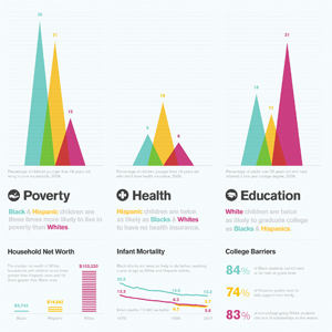 Here's a great infographic from Good.is (a site known for their clean data visualizations). The infographic doesn't overwhelm the viewer with too much data and instead focuses on the most important stats. It is easy for the eye to flow from left to right to take in the info, and utilizes a simple color code so that anyone can make easy conclusions before diving deep into the design. The concept itself is controversial, but treated with respect, making it something worth sharing. While the infographic is a bit of a reading assignment, it feels like a magazine spread which makes it appear less daunting for any audience.
Big Brothers: Satellites Orbiting Earth
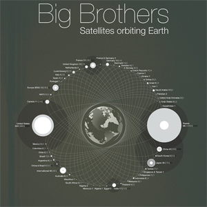 This design is simple yet eye opening. Rather than filling this out with further info, the designer chose to focus on 3 stats for each country and merge them into 1 thorough visualization. The creativity of this as well as the political subject matter make it a very sharable infographic. If all of these stats were told with 3 separate graphs, this infographic would not be as appealing. In other words, designs with a visual hook can go a long way when trying to get links (and will also increase time on site).
Viral Visualizations:
Viral visualizations are infographic designs that try to accomplish the following tasks: Determine a hot topic/concept, find supporting data, make it stand out with great design (eye-candy) and creative visualizations. While some feel that viral visualizations are harming the traditional infographic, if done right, viral visualizations have a very large audience that brings with it a huge opportunity for link building.
The Year in Names
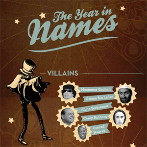 Created for Whitepages, this infographic is a great example of a viral visualization. It plays on pop culture references, incorporates original illustrations, and supplies some data visualizations ensuring that anyone can take in the information with ease. Because of the original artwork and the fun subject matter, this infographic has easily gained many inbound links.
100% Pulp: Pulp Fiction Personified
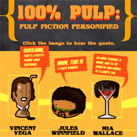 This is a great example of how infographics have many different categories of design. While this does not include any data visualizations, this is a great example of a viral visualization taken to the next level. If you view this design on Harks website, you'll quickly find a nice Easter Egg: click on the images and you'll hear sound bites from the movie Pulp Fiction. This addition, combined with the funny subject matter and great illustrations makes this an infographic worthy of many links.
Iconic Visualizations/Visual Metaphors
Infographics that use a well-known icon to create a visual metaphor often get a lot of attention for their unique take on everyday images. They are easy to understand since they use a common image as their foundation, but often do not include a lot of data visualization (if any). What makes them stand out is the fact that they are putting a unique spin on an old idea. Of course, these aren't the easiest infographics to create because once an icon is used, its impact has been made as well. In other words, nobody wants to see 20 Candy Land style infographics; its cool the first time, but just a copy the next time. So if you can come up with something unique that hasn't been done for a visual metaphor, you're bound to get points (links) for originality and creativity.
The Best Movies of All Time Map:
 This visual metaphor uses the New York City subway map to showcase the best movies of all time. Like the subway system, there are different paths that can be taken, which act as genres in this piece. There are a few subway map infographics out there, so this is not an icon to repurpose going forward.
The Periodic Table of Typefaces:
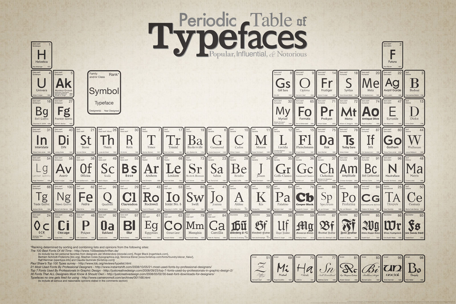 This is a favorite among designers. It uses the periodic table to showcase different fonts and if anyone knows the design audience, they know that fonts are like candy. That's what made this infographic so successful: it spoke to the inner nerd in every designer by taking an iconic image and using it as a visual metaphor for typography. When your visualization speaks to its audience so clearly, its bound to get links!
Business Insights
While this is a topic or concept for any of the categories of infographics listed above, I thought it necessary to call out. The concept of helping someone increase profits through providing helpful insights and tips is the backbone of companies like eMarketer. There is so much data out there to help someone find success in their online venture, but its hard to take it all in. Because of this, infographics that clearly visualize this information in a way that provides actionable takeaways, means a lot of link opportunity.
How Do Colors Affect Purchases?
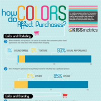 Kiss Metrics is known for creating informative business insight infographics. One of their most successful is this one, about how colors on a website, a store sign and in sales messaging, affect consumer purchase decisions. This infographic would not be as successful if the design wasn't so clean and easy to take in. The layout provides a good storyline that leaves the viewer with enough tips to improve their own sales either online or offline.
Bounce Rate Demystified
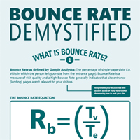 Since Kiss Metrics does such a great job of creating business insight designs, it seems best to call out another one of their infographics. This one is good for any online marketer since it explains the all to elusive thing we know as bounce rate. The design is clean, the info is easy to take in, and the story ends with tips to improve bounce rate. If you have clients with a complex system or tool set that they are trying to sell, consider creating an infographic that demystifies this service, making their product easier to consume by any audience.
In Conclusion:
As you can see, a lot goes into creating a link-worthy infographic including the right hook, data, and good design. Too many infographics fail because their topic is poor or their design is sub par. A good topic combined with good design can mean the difference between high quality links and a wasted investment.
More about infographics & link building:
About the Author: Amy Balliett