Toll Free: 1-877-695-7388

GTA: (647) 699-2838

Search Engine People
  • SEO
  • SEM
  • CRO
  • Display
  • Blog
  • Why Us
  • Contact
  • Join Our Team
  • Get A Quote

Toll Free: 1-877-695-7388

GTA: (647) 699-2838

Why You Should Choose Responsive Design Over A Mobile Site

Jieun Yi | July 23rd, 2014
Tweet63
Share18
Share
Pin
81 Shares

According to Google, over the past two years alone, mobile search traffic has increased five-fold.

As more and more customers are on the go, searching for products and services from their mobile devices it's becoming imperative for businesses to engage with their customers and enhance their mobile experience. For some businesses building a separate mobile website may seem appropriate.

We'll review and compare the differences between a separate mobile site vs. responsive design... and why Responsive Design is better.

What Is A Mobile Site?

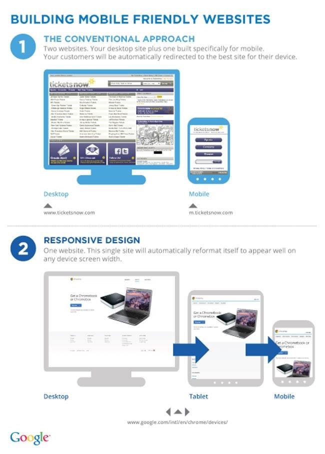
In a nutshell, a mobile website is a copy of your website where the server does the work to deliver the page that is smaller and easier to navigate.

You usually create a different domain; ie. "m.company.com"

What Is Responsive Design?

Responsive design is one site that adapts to the viewer's device whether it is a laptop, smartphone, or tablet.

Responsive is a design technique that automatically resizes and adjusts the website on various device screen sizes and orientations. Content for all devices is thus served from the same domain.

clip_image002

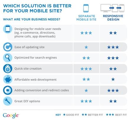
Mobile Site Vs. Responsive

clip_image004

Google Prefers Responsive: Responsive design has one URL and the same HTML, regardless of device. This means that it is easier for Google to crawl, index, and organize content. Don't take our word for it,;check out "why responsive design" from Google.

Maintenance (Time is Money): A separate mobile site needs TLC too! Creating a mobile site means having a separate mobile domain. Consider not only the cost of maintaining a second site; chances are you will have to update your mobile site every time you update your desktop version! And of course, with a mobile site, you have to update it in accordance to new phones, tablets, mobile browsers etc... Time is money!

Responsive design means one site for multiple devices, so maintenance is easy... one website is cheaper than two.

SEO Value: As mobile sites use a separate domain links are split between two sites. Responsive design on the other hand has all link love and social traffic go to one and the same domain.

Conclusion:

Easier to manage, preferred by Google and more "future-ready": Responsive Design is in general the way to go and a better run for your investment in the long run.

Tweet63
Share18
Share
Pin
81 Shares
Posted in Mobile, Web DesignTagged mobile, Web Design

2 thoughts on “Why You Should Choose Responsive Design Over A Mobile Site”

  1. naeem says:
    July 24, 2014 at 12:41 pm

    agreed on the responsive verdict.

    Our online store (200 000 visitors a month) for the last 3 years had a mobile site (redirect) while it did work and did the job, it was never as polished and in line with our design.

    Earlier this month we revamped our store and went responsive, eliminating the mobile site. We have seen a significant increase in engagement, time spent and sales/conversions.

    More importantly, we’ve see strong growth in the tablet/phablet demographic too.

    Over time i’m certain our SEO will get a boost too 🙂

  2. Jean-Luc Winkler says:
    July 25, 2014 at 7:36 am

    Nice article on responsive disgn! Of course Google is recommending the less crawl intesive mobile design to save resources on their end. In my opinion the contextual environment of the visitor is also important: Just fitting the same kind of content on a smaller screen leaves a lot of potential behind. How about tailoring the content itself to the situation the visitor is in at the moment? Instead of displaying long articeles they could be summarised when visited from a mobile device that is not connected to wifi etc…

Comments are closed.

Recent Posts

  • Maximizing Your E-Commerce Sales:
    A CRO Audit Guide
  • Movin’ On Up! Why Migrating to Google Analytics 4 (GA4) Should be a Priority
  • A Year in Review: The Digital Marketing Trends That Defined 2021
  • The Basics of Video Marketing
  • Just How Much Do Google Reviews Impact Your SEO Ranking?

Categories

  • Analytics & ROI Analysis
  • Company News
  • Content
  • Conversion Optimization
  • CRO
  • Display Advertising/RTB
  • Email Marketing
  • En Español
  • En Français
  • Inbound Marketing
  • Lead Nurture & Marketing Automation
  • Local Search
  • Marketing
  • Mobile
  • Partnership Marketing
  • PPC
  • PR
  • SEO
  • Social Media Marketing
  • Web Design

Additional Posts

Content Marketing as a Key Element of Consultative Selling

July 23rd, 2014 | by Brian Farrell

3 Ways To Safely Diversify Your SEO Strategy

July 22nd, 2014 | by Heather Ribout

Inbound Marketing on a Shoestring Budget [5/5]: Delight

July 21st, 2014 | by Andrew Marsh

LET'S TALK

Need more information or want to get in touch?

Get in touch!
  • SEO
  • SEM
  • Display
  • Blog
  • Why Us
  • Join Our Team
  • Contact Us
  • Local SEO
  • Small Business SEO
  • Enterprise SEO
  • International SEO

LOCATION

1305 Pickering Parkway,
5th Floor Pickering, L1V 3P2

PHONE

Toll Free: 1-877-695-7388
Greater Toronto Area: (647) 699-2838

Social

© Search Engine People Inc. 2023 – Canada’s Top Digital Agency
© SEP 2023 – A Search Engine People Company | Privacy Policy

Search Engine People