We no longer create websites that have fixed size layouts of 960px wide. With an ever-growing range and variety of different screen sizes we now create websites that visually look great no matter what device they are viewed on: Responsive Design.
What are the current trends in web design that would give your website the edge amongst your competitors?
Here is a collection of new web trends we can expect to be on the rise:
1. Landing Page Tweaks
A hero shot, product benefits, rich content, social media functionality, and above the fold, clear call-to-actions are effective ways of constructing a great landing page to capture the user's attention. Here are a few tweaks to implement on your next landing page for better conversion:
Big Headlines - Headlines should be the biggest copy on your webpage that visitors quickly notice. Make sure the main headlines are clearly visible and laid out in a way that helps you highlight the value of your service or product.
Oversized background images - Large photos are an excellent way of clearly drawing the user's attention to your core products/services/offer as soon as they view your page. Also having big, bold and high quality visuals can often help seal the deal.
Clean & Minimalistic - Less clutter on the page and a lot of white space will drive fewer users away. By using flat design, you will help convey a clean professional landing page with concise content.
 |
2. Mobile Interface Enhancements
One problem with mobile devices is the screen size.
In a responsive view all page elements need to be arranged underneath another or they must be hidden from the user.
Off-Canvas layouts are new techniques that utilize space outside the browser's viewport to hide elements until the user clicks to see them. Various apps and websites are already using this technique like Facebook, The Next Web, and Mashable.
 |
A mobile navigation toggle gives you the ability to hide or reveal a website menu. You want to give your users access to all your important links without flooding the page and taking up screen real estate.
Creating big fly out navigation makes a much better user experience in terms of readability and tap gestures. Of course, there are various techniques but there is no right or wrong way. Just choose a solution that fits your responsive design nicely.
3. HTML5/CSS3 Improvements
You no longer need Flash to create web animations and interactivity or different images for hover statements.
CSS3 makes it possible to animate, create call to action buttons that look like image buttons but aren't, and hover effects or validated styled forms. These are all possible without the use of JavaScript. Just remember not all browsers support all of these features yet.
CSS3 is also used to handle all the media queries to adjust the responsive behavior for desktop and mobile screen resolutions. Using CSS3 and flat design principles in combination work well together to bring you new features like interactive presentations, web-based applications, and quick startup websites.
4. Retina Display Techniques
Using one single file sprite with different sizes is a thing of the past; SVGs (Scalable Vector Graphics) are becoming widely supported.
SVG offers a truly scalable resolution-independent graphic and is a great solution no matter the zoom level or resolution your device is using. Again, keep in mind that not all browsers support the SVG format right now and you can always use PNGs as a fallback.
 |
Icon fonts offer many features compared to bitmap image icons. One problem with bitmap images is that they get pixelated when scaled up. Icon fonts have all the same properties as a normal font, which means they are completely scalable to any retina/Hi-DPI devices.
5. Flat Web Design
 |
Flat design is in and Skeuomorphism design is out! What is Skeuomorphism!? (pronounced: skyoo-uh-mawrf) It means applications are designed to look like their real-world counterpart.
Apple embraced skeuomorphism in a majority of their apps.
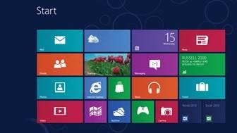
Today, flat design is becoming popular and many others are jumping aboard. For example, Microsoft Windows 8 interface uses flat colors, no drop shadows, the focus on typography, simplistic interfaces and the use of color contrast encourages specific user actions.
Other Trends To Mention
- Content first
- Social media integration
- Bigger call-to-action buttons
- Website frameworks
- Content marketing
- A focus on typography
Conclusion
These trends don't apply to everyone -- but there are few that can optimize and increase conversions on your website in a big way.
You can give your company credibility and the leading edge amongst other companies who fall behind. Review your own website or landing page and see what you can improve.
What trends are you predicting to be the most popular in the age of responsive design?

