

The mobile revolution has arrived and is here to stay! For businesses, the first step to conquering this new arena is adapting any of the following strategies to cater to mobile users: a responsive web design, a mobile-focused website or a mobile app. The next and most crucial step is deciding how to optimise your content for mobile devices.
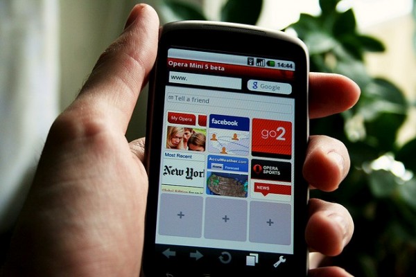
Image credit: Johan Larsson (Flickr) License: Some Rights Reserved
Knowing Your Target Audience
But before you start creating content for mobile, you must first get to know your target audience by looking into the following factors:
- User's Device Preferences
Find out what exactly what type of mobile devices your existing and potential customers prefer to use. According to data compiled by We Are Apps, men in the 65+ age group are more likely to own smartphones compared to their female counterparts. However, in younger age groups of 15-34, more women own smartphones than men. As for tablets, the survey finds ownership is broadly similar across all age groups, with a slight increase in the 35-44 and 45-54 age groups. It's also noted that men are more likely to own tablets than women across various age groups. The study also revealed that iPhones are the most popular device among UK consumers, garnering over 32% of all respondents. But it's clear that the Android market is quickly on the rise. Knowing this information will help you determine which device you're going to focus your content on. - User's Browsing Habits
You also need to find out what they're using those devices for. According to the 2014 Mobile Behavior Report, emailing, text messaging, searching for info online, and social networking are among the most common activities performed on smartphones. On the other hand, searching for info online, emailing, watching TV or videos, and social networking are the most popular activities done on tablets.
Your consumers' browsing habits will help you understand what kind of information to provide for increased user experience on mobile. - User's Connectivity Preferences
Another crucial factor to consider is how your target consumers prefer to connect to the internet. Do they use free Wi-Fi? Or do they prefer using 3G and 4G networks? People using Wi-Fi connectivity are usually staying put in a certain place like a cafe, office or their homes. For this reason, they may prefer a built-for-touch and laid back browsing experience. They may also have time to read textual content, watch videos, and check out various images.

Image credit: Pixabay.com License: Public Domain CC0
On the other hand, people using 3G or 4G connectivity are typically those on the go, so they don't have time to browse through several pages of content. They want to get clear and direct to the point information quickly.
Knowing Different Hardware Specs
Indeed, not all mobile devices are created equal. Each smartphone and tablet model offers different features and capabilities that can affect how your content and your website as a whole will appear to mobile consumers. Here are some of the most significant differences you must take note of:
- Smartphone screen sizes vary from 3.5 to 6.3 inches, while tablet screens are typically 7.0 to 7.11 inches.
- Smartphones are usually equipped with Wi-Fi as well as 3G or 4G connectivity.
- Tablets typically have only Wi-Fi connectivity. There are some models that have both Wi-Fi and 3G, but they tend to be more expensive.
- Tablets tend to have larger internal memory capacities than smartphones.
Ingredients of Mobile-Friendly Content
Now that you've looked into the important factors and looked through the different hardware specs, it's time to determine the ingredients you need to create mobile-friendly content:
1. Touch-Friendly design
With smaller screens to work with and the absence of a cursor, it's harder for users to click a certain element on a webpage. To avoid subjecting your consumers to this kind of frustration and inconvenience, you need to adapt a touch-friendly website design. Here are some tips that will help you:
- Add touch-friendly elements like carousels, accordions, panels and drawers. You can use Mobify's collection of open source JavaScript modules to help you with this task.
- Follow the rules provided by various mobile platforms when creating touch targets for your content. Here are the guidelines for iOS devices and for Android devices.
- Look for better alternatives to hovers like links to other webpages on the site. You can also create more relevant pages to your site.

Image credit: Pixabay.com License: Public Domain CC0
- Use a translucent user interface for certain elements on your site to let users know that there's additional content behind them.
- Use large font sizes for textual content. A minimum of 12 point is ideal. If your webpage contains links, use a different size and colour for them so they would be easier to read. This may vary depending on the device, but the standard is 22 pixels with a 14 point type.
2. Finger-Friendly design
Aside from being smaller their desktop counterparts, mobile screens are more sensitive to touch. Pair this with large adult fingers and you have a recipe for frustration and inconvenience. Fortunately, you can avoid this with the following techniques:
- Use larger and more colourful buttons. Take note that the average fingertip takes up approximately 45-57 pixels, while the thumb is 72 pixels on average. To accommodate adult fingers, make sure the height of each button is at least 35 pixels and the width is 55 pixels.
- Increase the space between various touch targets in your content so users can easily tap on your links, social media outlets, and calls to action.
- Use a lot of negative space. This will help make your content as well as various functionalities in a webpage look more noticeable and easier to read.
3. Clickbait Headlines and Bite-Size Information
Internet users are notorious for having short attention spans. This is even more so for those using mobile devices. To catch your target audience's attention, you need to:
- Use unique clickbait headlines. Make sure they are not more than 10 words, ideally between 5-8 words.
- Make sure your headlines are also relevant to your topic, but not so much that they give away the ending. You can find useful tips on creating catchy headlines here and here.
- When writing content, choose only the information that your users really want and need. These may include your address, contact number and business hours.
- Position the most important pieces of information at the top of the webpage.
- Break up text to subsections make the entire content scannable.
- Focus on localised content. A study conducted by Google and Neilsen found that 40% of all mobile searches were done with a local intent, so catering to this need is beneficial for your business.
4. Font-Based Icons
Higher pixel densities and resolutions on high resolution screens of tablets can make certain graphics look pixelated.
- Use font-based icons to solve this issue. This type of graphics scale well on high resolution displays, making them ideal for tablets and smartphones.
- Design your own unique icon font sets to match the graphics on your website using programs like Font Awesome, symbolset, and iconsweets.
5. Clear Social Sharing Buttons
Mobile users love to share information, which is beneficial for you as it helps increase brand awareness. Here's how to make it easy for people to share and bookmark your content:
- Use clear and consistent social media buttons throughout your website.
- Position them in areas where users can easily spot them when viewing your webpage.
How You Can Keep It Up
Keep track of how your content is performing to know if it's getting your expected number of visitors and conversions. You will need to check your Analytics report for this. It will give you information about the following parameters:
- Overall bounce and exit rate
- Number of first-time visits
- Number of repeat visits
- Bounce rate of every page for different devices
- Number of pages browsed
- Exit rate of every page for different devices
Studying these parameters will help you find out how effective your mobile content is and what you need to do to make it more appealing to your target audience.
About the Author: Richard Eaves


