


Flickr image by Hugo van Tilborg
When it comes to landing page optimization science, there are certain people in the industry I look up to.
Every once in a while, I come across an insightful piece of advice from them that works like a bolt of lightning, inspiring me to improve my ways.
More often than not, this advice pertains to cross-discipline areas, such as mobile SEO, neuroscience marketing, semantic search, etc. And, it is thanks to this advice that my webpages don't look like this or like this. 🙂
OK, kidding.
Here are some awesome tips I stumbled upon lately. Enjoy!
1. Blending Content Types on a Webpage Is Wrong

Flickr image by Frans Persoon
Brian Massey, aka "the conversion scientist", recently wrote about the need to diversify your approach while writing page copy for different segments of prospects.
Brian refers to a strategy used by Eugene Schwartz, a legendary copywriter, who would vary his copywriting tactics, depending on how far the prospects were in their buying cycle. Thing is, your prospects normally range from people who know nothing about your brand to people who know your products inside out and are likely looking for particular details.
So, you'd need to create different content for each group.
"We know we're blending
We know we're blending when we want to put one more "value proposition" on a webpage, even when we dont have room. "Hey, let's use a rotating hero image!" - Brian Massey
2. To Get People to Do Stuff, Use Nouns Instead of Verbs
Susan Weinschenk, also known as "the brain lady", says that, when you use nouns instead of verbs on a landing page, this trigger greater response from your audiences.
"In a survey about voting, Gregory Walton at Stanford sometimes asked "How important is it to you to be a voter in tomorrows election?" versus "How important is it to you to vote in tomorrows election?"
The first sentence was phrased so that the emphasis was on the noun, "voter". The second sentence emphasized "to vote". Did the wording make a difference?
11% more voted when the the noun (be a voter) was used instead of the verb (to vote)." - Susan Weinschenk
3. Place Higher-Priced Items First
In her recent article, Mona Elesseily talks about how placing higher-priced items first thing on your page helps you boost sales.
"We connect/relate to what we first see. In the book called Predictably Irrational by Dan Ariely, when test subjects were asked to think about their social insurance number and then guess the price of a product, people with higher social insurance numbers guessed that products were more expensive than people with lower social insurance numbers." - Mona Elesseily
Mona also says that, when expensive products are placed near the top of the list, they get selected more often. So, it is best if the prices on your landing page go from highest to lowest, not vice verse. 😉
4. Mobile SEO tip: Responsive Web Design Is Not Always the Best Option
Responsive Web design seems to be enjoying its moment of glory with both SEOs and web developers right now. However, it is by far not always the best solution from the SEO point of view, says Bryson Meunier (emphasis and links are mine).
"The one URL argument for dynamic serving and responsive designs superiority is moot with the introduction of switchboard tags, as Google can now understand which site should appear when, regardless of URL structure." - Bryson Meunier
As Bryson points out, there may be certain reasons the webmaster may want to choose a separate mobile URL over responsive Web design, these being:
- Mobile users are often looking for different information than desktop users
- Mobile users may use different keywords than non-mobile searchers
- Responsive layout often increases load time significantly
- Feature phones do not support CSS media queries
- It's not always best from usability point of view
5. Page Not Optimized for Mobile? No High Google Rank for You (Soon)

Google's Yoshikiyo Kato and Pierre Far of Goolge co-blogged recently:
"Smartphone users are a significant and fast growing segment of Internet users, and at Google we want them to experience the full richness of the web."
Later in the post they add that, if your page contains certain wide-spread mobile SEO mistakes, this may soon start preventing it from ranking highly in Googles mobile SEPRs, as Google is planning to tweak its algorithm to reward those who try to optimize for mobile (smartphones in particular) in the near future.
6. Colors have a strong effect on users
According to Zach Ball of Coggno:
"Blue conveys a sense of trust and reliability. Notice how many businesses use the color blue in their logos. Red is exciting, a warning, stop, or blood. Black can be evil, nothingness, modern, or stylish. Yellows and oranges are fiery, flashy, and bold. Green is natural, money, or calm."
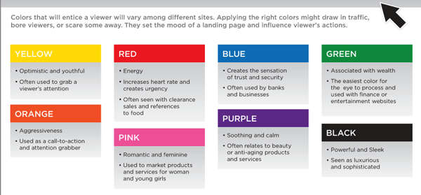
Follow Zach's advice to craft your webpage's color scheme in accordance with the aim you're trying to achieve.
7. Do not use redirects when A/B testing landing page versions
In a recent post published on the Link-Assistant.Com blog, Ksenia Dobreva recommends to refrain from using redirects when testing different version of a landing page - the one thing conversion optimization specialists are often tempted to do.
Instead, use appropriate options in Google Analytics.
"Do not use redirecting for showing different pages for the users. If you break the rule, be ready to be penalized by Google very soon. Content Experiments service in Google Analytics uses JavaScript and cookies to perform the testing." - Ksenia Dobreva
8. Too Many Social Sharing Buttons on a Page May Be Intimidating
Have you ever seen a blog with dozens on sharing buttons on it? I have. And, to tell you the truth, such abundance of sharing buttons on a page makes you less likely to click on the ones you'd use - just because you won't always bother finding them among all the options.
And, Jordan Kasteler says it just so well:
"Too many social sharing buttons can "cripple decision making." Many sharing buttons, like AddtoAny or ShareThis, include several networks to which a user can share content. However, the majority of online users only use five main social media networks: Google+, Facebook, Twitter, LinkedIn and Pinterest."
9. You Can Give Away All Secrets and Still Get People to Buy from You
I came across this idea as articulated by Aman Basanti of Your Web Design Shop. He says (while talking about e-books, actually) that you can give away all the gems/insider information/secrets on your page, and yet get prospects to buy the whole thing. See for yourselves:
"If you have been holding back on content because you are scared that people will not buy your ebook or course, then stop holding back. You can give away just about all your content, including some of your best stuff, and people will still pay for an e-book.
Why? Because the value of an e-book or a course is not in the content it provides, but in its organization. It is in its ability to bring together relevant pieces of information in one place and connect the dots between them. It is to turn otherwise isolated and disconnected bits of data into an actionable plan." - Aman Basanti
I myself have watched movie trailers that clearly give away the movie's best moments - then went to watch the entire movie anyway. The trailer has the dots - the full movie shows how they are connected. 🙂
10. Conversion Optimization Classics: "Nothing Beats A Good Tagline"
Ok, here is some good old marketing wisdom to leave you with... In his epic book "Dont Make Me Think", Steve Krug says that nothing beats a great tagline, which is particularly true if your landing page is your home page.
"A tagline is a pithy phrase that characterizes the whole enterprise, summing up what it is and what makes it great." - Steve Krug
In my opinion, taglines are important for 2 reasons:
1. They can inform the visitor what the page is about in a spit second
2. They often appeal to the emotional side of the visitor (for example, when your mission statement happens to be just in synch with the prospect's inmost values).
So, when preparing a landing page, do include a tagline if possible.
🙂
Liked the tips provided in this post? Share it with those who'd find it useful.
And, happy landing page optimizing!


